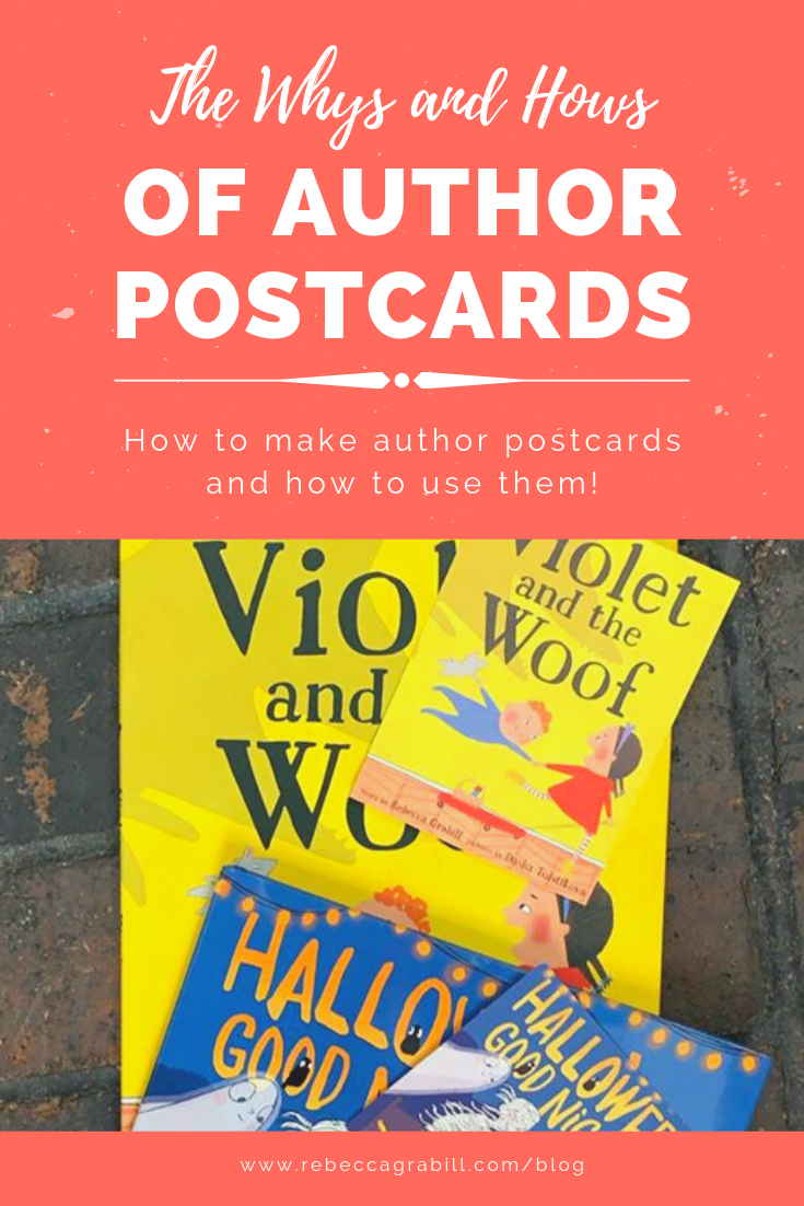
The Whys and Hows of Author Postcards
I did a lot of googling, considering, wondering before I decided to make postcards to go along with my first book's release. I needed to think about time it would take to design, expense to print, ultimate usefulness. Ultimately I decided in favor of postcards, and I'm glad I did. Below discover why!
Reasons to/not to Create an Author Postcard
One of my main considerations was, "What's the point? Are author postcards actually worth it?" There were a lot of reasons not to, like:
It's time consuming to design and have printed.
It's potentially quite expensive. I first looked at sites like Shutterfly (yes, I'm that much of a "noob"!) and the cost was mind boggling.
I don't want to have hundreds of postcards sitting around that nobody wants.
But there were reasons to do it, as well:
Not all my events would be selling books. What better way to keep my book on visitor's minds after they'd left?
Kids (and adults) love to get "stuff" and often the actual "stuff" doesn't matter as much as the fact that it's free. A stack of Take One postcards could draw people over to me during signings or other events. It also gives me something to give people who ask about my book, like the woman next to me on my flight home from VT or the Barnes & Noble salesperson who claims she can only order the kindle version of the book (um, nope, I guarantee it's in print!).
I have a ton of educational resources on my website. There's no way I could tell everyone about it, but I could hand them a postcard and say, "Hey, check out the crafts I have online!" It also gives them the actual spelling of my site/name so there's no need to rely on memory.
The reasons for ultimately won out over the reasons against. Add to it that I enjoy designing things (and have background in design - not a prerequisite by any means!), had set aside a small sum for the project, and discovered that a website like Vistaprint would cost pennies per card. Decision made, what next?
What to/not to Include on Your Author Postcard
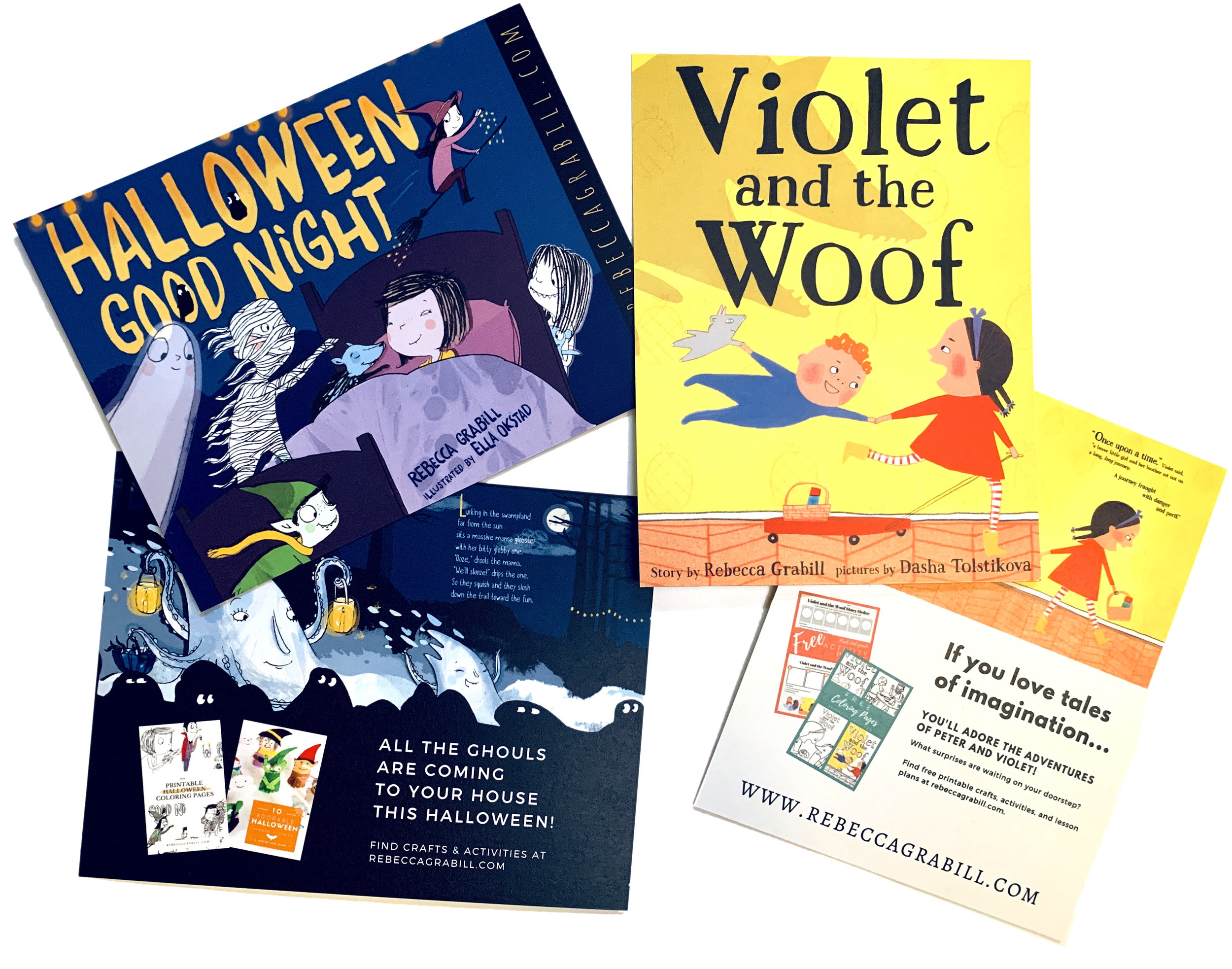
I knew I'd need a few simple things on the postcard: The book's cover, my name, my web address. Beyond that, what to include? I read a handful of articles and looked at sample after sample. Some stunning, some more "invitations" to a signing or other event, some ultra simple. I came up with a few guidelines based entirely on my own needs. I.e., I didn't plan to use the cards for any specific event, nor did I plan to mail them out. And I wanted them to be somewhat "evergreen" meaning I could use them next year too, if I didn't unload them all before Halloween. Though I think I'll start leaving them in public bathrooms before I do that! (Kidding. Maybe.) Here are my Dos and Donuts...
Do NOT include dates of any sort, unless your postcard's only purpose is advertising an upcoming event. Why? As soon as the date passes, the postcards are outdated and old. Nothing says "Unprofessional" like handing out an expired card.
DO include the book cover, title (because not all titles are easily readable on the cover), author's name, and website if that's a priority.
DO have some sort of "Call to Action" like buying the book, visiting a website, attending an event, booking you for a lecture, etc.
DO proofread carefully, and have friends proofread too. Using white-out on 500 postcards is gonna take a long, long time.
CONSIDER having your postcard printed on both sides. More on that below!
DO print a sample on your home printer to proof hard copy. I didn't do this, and I'll tell you why I regret it right now...
Tips for Designing an Author Postcard

First, the things I did right: Focus on the book. The front of my card has the book's cover central with an unobtrusive background. It has a slogan of sorts ("Your New Halloween Favorite!"), and has the call to action mentioned above. I also included some marketing text and a line from the Publishers Weekly review.
Which was my oops. Had I printed a test copy instead of relying on my screen, I would have seen right away that the text was just a smidge too small and the contrast not quite enough to make the text really readable. It is readable, but not at a quick glance. I think the better option (which I'll keep in mind for the next printing, if there is one) would be to think of a postcard sort of like a billboard. It's getting a glance from someone going sixty miles per hour. There's only so much information a person can take in!

Now the back of the card, that works for my purpose, but could be tweaked for any purpose you want. I wanted especially to draw readers to my website, and to list upcoming events for those who haven't yet purchased the book. That said, I didn't include dates. This might bite me in the behind next year if I'm not at the same places (if I have cards left), but as this is a Halloween book, chances are good I'll be attending at least a few of the same venues. Of course I have my next book slated for release on October 1st, so... Oooh, did I just say that? That's not official intel yet! Well, now you know.
As for printing, I mentioned Vistaprint, which was economical. I could have printed it on my home printer, though I'm not sure if I'd save anything given cost of ink and postcard paper. I'm sure there are many, many companies that do small run print jobs for a competitive price.
Update! I redesigned my author postcards!!
I wasn’t at all happy with the previous design, so I decided to keep things simple, very simple. And the ultimate result is incredible!
So what do you think? Is a postcard right for you?


Making a book trailer can be as easy or as complicated as you want. I’ve made all of mine with nothing but iMovie, photo editing software, and an internet connection. I’m not a video expert by any means, but here’s a brain-dump of everything I know about creating a video trailer yourself, for free!